2024 | General
The Art of the Film Poster
From November 3 until March 3, 2024, 300 film posters could be seen in the Kulturforum. The impressive special exhibition “The Big Screen – Film Posters of All Time” put on by the Kunstbibliothek had been created in collaboration with the Berlin International Film Festival and the Deutsche Kinemathek. As part of the exhibition, 26 guests - including the Berlinale’s Artistic Director Carlo Chatrian and Executive Director Mariëtte Rissenbeek - had chosen their favourite posters to be presented.
In this interview, exhibition curators Christina Thomson, head of the Graphic Design Collection, and Christina Dembny, co-curator, talk about the focus of the collection, true rarities and what makes the perfect movie poster.
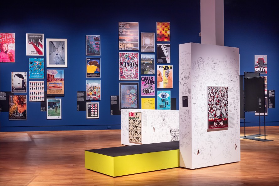
View into one of the exhibition rooms in the Kulturforum
How did the idea for the exhibition come about?
CT: Movie posters form an important part of our graphic design collection in the Kunstbibliothek. We’ve had previous collaborations – for example, with the Berlinale – that have led to exhibitions. The question of whether and how we wanted to build on this and continue the collection in the 21st century prompted this current exhibition. Plus, my great love for the 2 x 3 metre Metropolis poster. I’ve been wanting to create an exhibition around this gem for a long time now.
CD: It became clear over time that “The Big Screen” would be an exhibition dedicated entirely to film posters. We are focusing on our own collection which contains around 5,000 film posters in total – a treasure trove that definitely deserves to be presented.
You also sought out some help with the selection of the posters…
CD: Yes, indeed. We both come from art history backgrounds and we wanted to involve as many people as possible from other areas. Together with Mariëtte Rissenbeek, we asked people coming from film, television, cinema and graphic design to name a favourite poster. We then developed the concept of the exhibition further by working with the various participants. It was an extremely collaborative process.
CT: We felt that this shared view of our collection would be a more interesting and contemporary one than just our own. We now have 26 guests who have each chosen a fantastic poster and have explained their choice in a short statement. Recordings of these can be heard in the exhibition and they are also presented as written texts in the catalogue.
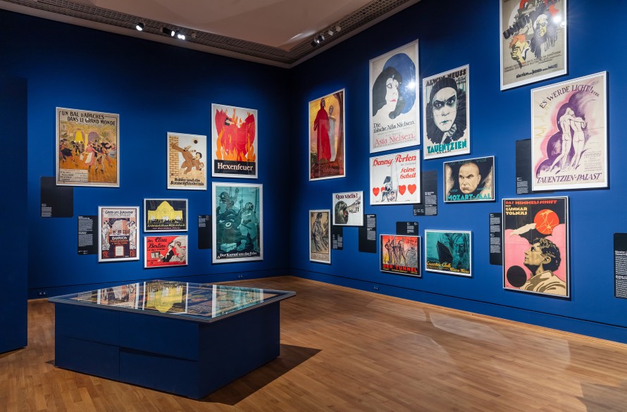
Posters from the early days of cinema
Considering that film started off by having to fight for its place as an art form in the official history of art canon, it’s surprising that the collection also includes works from the very early days of the medium. How did the Kunstbibliothek realise so early on that film posters were worth preserving?
CT: The Kunstbibliothek was founded over 150 years ago as the library of the Kunstgewerbemuseum. The museum collected examples of graphic design – including film posters – right from the start. The first film posters came into the collection in the 1890s, and from the 1920s onwards, the collection was also expanded retroactively. This continued throughout the century. The focus was on printing techniques and aesthetics, on design elements and on individual artists – because famous designers also worked for the cinema. Julius Klinger, for example, designed for the renowned printing and advertising company Hollerbaum & Schmidt. The posters came into the collection for their graphic design aspects. It was rarely about the content of the film, more about the forms, the designs and the techniques used.
CD: This is how particular areas of focus emerged in the collection. For example, the 1920s when there was an outstanding graphic design scene in Germany with many famous designers. We’re trying to continue this trend today, even if it can be hard sometimes to leave out your favourite films when their advertising fails to be relevant to the collection from a design point of view. We have softened the criteria to some extent: in addition to the artist and the design, the subject matter of the film can also play a role. A current example is the topic of “Women in Iran” which is represented in the exhibition by three posters. We try to collect as diversely and internationally as possible and thus provide a broad overview, but always on the basis of the graphic design.
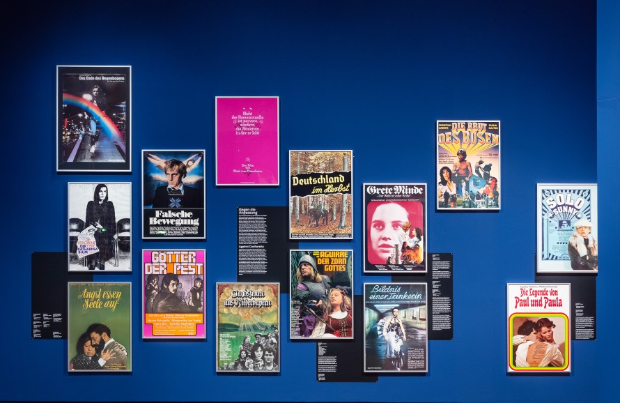
Posters from Germany West and Germany East
Did developments in the history of cinema such as the transition from silent movies to sound have an influence? The early posters appear to be designed much more with an international audience in mind because language played hardly any role until the triumph of sound films. Later, the focus of the collection seems to shift somewhat to the German-speaking world…
CD: You’re right. The collection has a focus on Germany. But there are also posters from other countries. For example, we have a lot from Poland because Polish poster art developed an excellent reputation in the design scene very early on.
CT: And we also shouldn’t forget that this focus is connected to the two-pronged nature of the collection in a divided Germany. During the four decades in which the GDR and the FRG existed and the museums were divided, posters were collected on both sides of the Wall. They were then merged after 1989 and this is naturally reflected in the collection. In the GDR, in addition to designs from East Germany, they primarily collected posters for films playing in cinemas in the Eastern Bloc countries: Hungarian, Czech, Polish and Russian. In the West, a lot of the collecting centred around film festivals and the cultural phenomenon of New German Film was immensely important. But to return to your question: the earliest posters featured in the exhibition are indeed not German. Until the mid-1910s, film advertising was a completely international affair, with the first film posters frequently being French. They often had just the film title printed on them and no other text, and the designs work wonderfully. Later, the posters diverged, but that too appears to be just a phase. You can hardly tell the difference between posters from the last 20 years on a country by country basis. The film industry and its art work is a very international business. You have to approach this topic without national borders in mind or you won’t get very far!
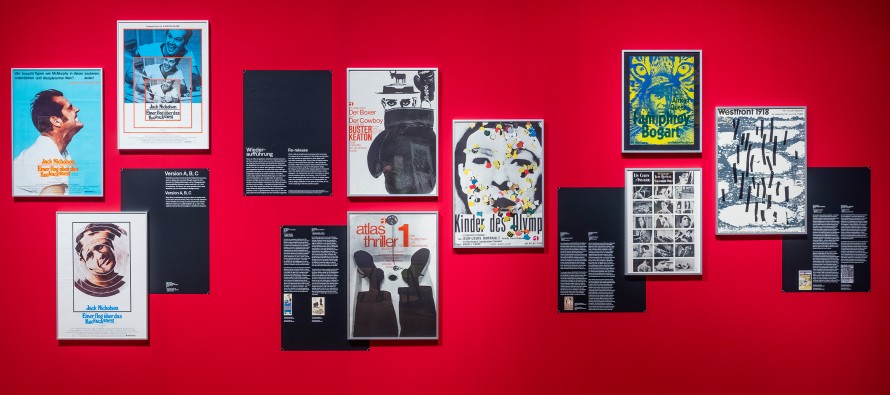
Posters of the Atlas film distribution company: films by Buster Keaton, Les diaboliques, Les enfants du paradis
The immense variety in different versions – both official and unofficial – of posters for popular films that can be found on the internet raises a question about how film posters are actually collected. Are there any distinguishing criteria for the “original poster”?
CT: Here too, it’s always about the quality of the design. We’re not a film archive of record and therefore we’re free to apply our own criteria. If a teaser poster is more interesting in terms of design than the distributor’s official poster, we’ll add the teaser to the collection. Or the festival poster. Or, for older films, posters created for a revival. In the 1960s and 70s, the distributors Atlas & Kirchner hired avant-garde graphic artists to design new posters for old films and these are often more exciting from a graphic design point of view than the posters for the film premieres.
CD: Almost all the posters in the exhibition are originals in that they were printed when the film was released. But here, too, there can be differences, for example, between the posters for the world premieres and those for different national releases. When Planet of the Apes opened in cinemas internationally in 1968, each country designed its own poster - and each of them is an original.
And yet collectors spend up to $700,000 on a film poster. So there seems to be a certain fetish for the “original”…
CT: Prices like that are connected, on the one hand, to a cult around certain films and, on the other, to rarity, i.e. availability. Our Metropolis poster is the large French version, with this probably being the last existing original print. We’ve been researching for 20 years and haven’t yet found another copy. The poster is also extremely iconic, which further increases its value. The question of how to collect, where the posters come from and how we identify the original has, of course, changed significantly in the 21st century. Now that we’re in the digital age, completely new rules are emerging for what constitutes an original poster and how to obtain a printed copy, because the “original” no longer necessarily has to be on paper. We became very aware of this during the preparations for the exhibition.
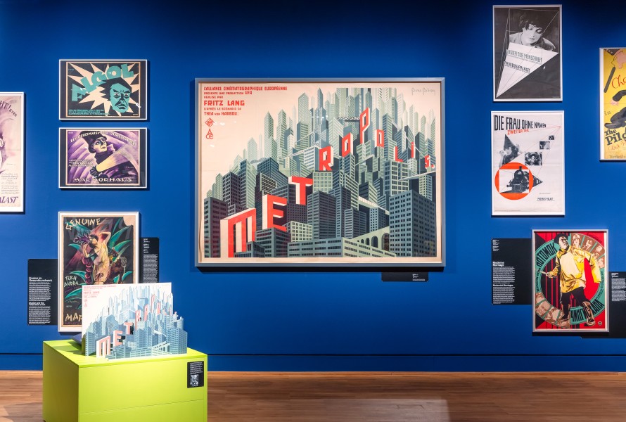
The fine art of the film poster: Metropolis
How do you, nonetheless, manage to obtain the posters?
CT: We usually approach the designers, the agencies or the distributors. We are then often sent something digital that is different from what we had in mind. That’s why, in many cases, we’ve decided to go back to the original key visual without any of the advertising slogans or quotes that are added later. Today, a key visual is developed and constantly varied to adapt to the various different media and formats. However, in my opinion, film advertising dilutes itself when it tries to adapt to everything and everyone.
CD: Streaming services are known to personalise their advertising. With Netflix, the preview image is adapted to the users’ preferences. Depending on what I’ve previously watched, I’ll get to see a romantic scene or an action scene even though they’re both from the same film. This is a complete reversal of the concept of the movie poster which seeks to distil an entire film into a single image and, with it, to appeal to as many people as possible.
CT: We are presenting different approaches to communication design in the exhibition. On the one hand, we have the individualised advertising strategy. Every country works differently and expects potential audiences to have different visual abstraction skills. For example, we found a collector of Planet of the Apes premiere posters. He owns 60 premiere posters from 40 countries which is an extreme example of diversification. The second strategy aims to achieve unity around a single visual that runs throughout the global campaign. The Rocky Horror Picture Show, Star Wars and James Bond movies are good examples of how, in the 1960s, people began to see film as a brand and thus designed their visual communication in the same way for each territory. In the 1980s and 90s, this approach was developed even further. Everyone knows the poster for The Godfather where the film title appears like a brand image. Or the logos for Batman, Ghostbusters and Jurassic Park – and even for Barbie.
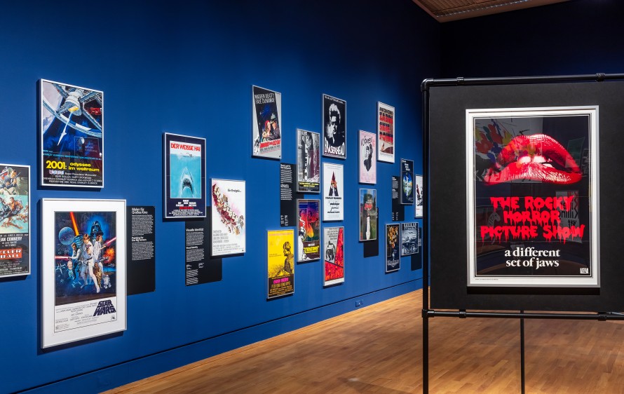
Motif of a global campaign: The Rocky Horror Picture Show
How has the aesthetic of the film poster developed?
CT: In principle, it’s less along the lines of the films’ content than the technical possibilities. Lithography, the first mass printing medium, created a different style than the later offset or digital printing. The media of design are similarly key: in the beginning, the artistic hand shaped the aesthetics by drawing and painting. In the 1920s, photographic elements began to be added for the first time and the collage emerged as a mixture of graphics and photography. The arrival of digital media created its own aesthetic. The 1990s are quite scary. Suddenly, everyone thinks they can design their own posters using computers. I would strongly link the aesthetic development to the technical and artistic possibilities of the respective eras.
CD: Individual design features are evident down the years even beyond the technology. We can see motifs that are typical of certain genres as early as the 1900s and 1910s. Back then, action scenes were already appearing on posters for adventure films. The “floating heads” familiar from Marvel posters have also been around since the 1920s. They’re actually always designed the same way, with portraits where the main character is the largest, and the “less important” the character, the smaller their image. This is supplemented by an action scene and the film’s title. That’s a very classic poster structure.
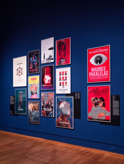
Madres paralelas
What are your personal favourites?
CT: Metropolis, of course, is and remains my absolute favourite because it perfectly expresses what makes a good film poster. It shows how a single image can make a film’s narrative, plot and mood tangible. And that, even though no people are visible on the poster. From contemporary posters, I would say Madres paralelas by Pedro Almodóvar. It was designed by the Spaniard Javier Jaén who turns a simple graphic into a visual sensation and creates a very memorable image with very few elements. The teaser poster shows a nipple in the shape of an eye and a teardrop that looks like a drop of milk. It’s extremely concise. And it caused a shitstorm on social media. For the official advertisement, Jaén designed a second version in which the two leading actors are embracing. Their bodies are depicted by black and white lines that merge into each other but at the same time run counter to each other. I think it’s a fantastic graphic metaphor for the film’s content.
CD: I’m a big fan of Polish and Czech film posters from the 1950s and 60s. Extraordinary schools of poster design developed in both countries because there were no government regulations, unlike, for example, with the demand for realism in painting. The advertising graphics were freer and the graphic designers used this space to develop extremely creative and unusual motifs. The Polish posters succeed in capturing the mood of a film in a single, rather abstract image without depicting a scene or any of the main characters. Images like this really awaken my curiosity.